Microsoft Excel is a spreadsheet software program developed by Microsoft Corporation. Businesses, finance, and other industries use it widely for organizing, analyzing, and visualizing data.
Excel allows users to create, edit, and manipulate data in a grid format of rows and columns. It has various tools and functions like formulas, charts, pivot tables, and macros for performing complex calculations and data analysis tasks easily. Excel is available for Windows, Mac, and mobile devices.
Excel is a popular tool for data analysis. There are several benefits of using Excel for data analysis, including its cost-effectiveness, user-friendliness, and versatility. You can easily analyze and visualize data, create insightful charts and graphs, and perform complex calculations with ease.
This blog is useful for anyone who wants to learn more about using Excel for data analysis, from a beginner to an advanced user, and who is looking to improve data analysis skills for work or personal use.
Get Started
Organizing Data:
Organizing your data can be a challenging task, but it is essential for effective data analysis.
Here are some ways and steps to help you organize your data:
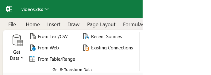
- Import data from different sources: Data comes in many forms, like text files, CSV, or databases. Importing data from different sources is the first step towards organizing your data.
- Format data for analysis: Once you have imported your data, you need to format it for analysis. This includes converting dates, numbers, and text into a standard format for analyzing it easily.
- Clean and prepare your data: Data cleaning is an important step in data organization. This involves removing duplicates, handling missing or incorrect data, and dealing with errors in the data. After cleaning the data, you can prepare it for analysis by selecting the relevant variables and creating subsets of the data.
By following these steps, you can organize your data effectively and prepare it for analysis. This will help you to gain insights and make informed decisions based on your data.
Essential Excel Tools:
- Formulas and Functions for Calculations: Formulas for calculations are one of the fundamental features of Excel. Formulas and functions perform various numerical calculations.
For example, adding values by using the SUM function or counting values by using the COUNT function. Excel has many built-in formulas that you can use, and you can also create custom formulas to meet your specific needs.
- Conditional formatting for visual insights: Conditional formatting in Excel allows you to format cells based on specific conditions. For example, conditional formatting to highlight cells that contain data that meets certain conditions. This can help you gain visual insights into your data and quickly identify patterns or outliers.
- Sorting and filtering for targeted analysis: Sorting and filtering help you tackle your data more effectively.
Sorting allows you to rearrange data in a specific order, such as alphabetically or numerically, based on a specific column or set of columns. Filtering allows you to display only a subset of your data based on specific criteria, such as displaying only data from a specific date range or only data that meets certain conditions.
These tools can help you perform targeted analysis and quickly identify trends or patterns in your data.
Diving Deeper: Advanced Techniques:
PivotTables:
PivotTables are a powerful tool for summarizing and analyzing large amounts of data in Excel.
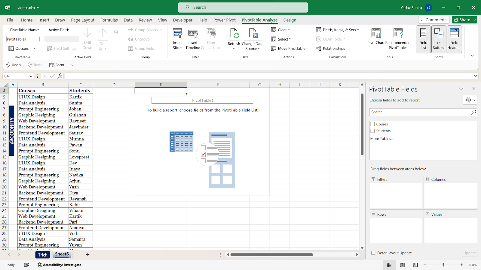
Here’s a breakdown of the three key elements of PivotTables and how to use them effectively:
Creating Pivot Tables to summarize data: To create a Pivot Table,
- First, select the range of data you want to summarize.
- Then, go to the “Insert” tab and click “PivotTable.”
- Click “OK” after choosing where to place the Pivot Table.
You will now see the “PivotTable Fields” pane on the right side of your screen. Drag the fields you want to summarize into the “Rows” and “Values” areas. Excel will automatically generate a summary table for you.
- Filtering Pivot Tables: Once you create a Pivot Table, customize it by filtering the data for deeper insights. To filter your data,
- Simply click the drop-down arrow next to a field name in the “Rows” or “Values” area.
- Choose the items you want to include or exclude from your analysis.
- Customize your data view by dragging fields across “Rows,” “Columns,” and “Values.”
Using PivotTables for data exploration and trends: PivotTables are also useful for exploring trends and patterns in your data. To do this,
- Simply add a time-based field such as “Month” or “Year” to the “Columns” area of your PivotTable.
Excel will automatically group your data by period, allowing you to easily see trends over time. You can also create calculated fields in your PivotTable to perform custom calculations on your data.
By mastering advanced PivotTable techniques, you’ll quickly analyze large datasets, gain valuable insights, and make better-informed decisions.
Charts and Graphs:
Choosing the correct type of chart, creating informative charts, and customizing them are important in visually representing data.
- Choosing the right chart type for your data: Charts speak volumes – choosing the right one ensures your data tells its story effectively. When comparing different categories of data, a bar chart is more suitable. On the other hand, if you want to show trends over time, a line chart is more appropriate.
- Creating effective and informative charts: Creating effective and informative charts involves presenting the data clearly and concisely. This means using appropriate labels, titles, and colors to make the chart easy to read and understand.
- Customizing charts to enhance clarity: Customizing charts means making adjustments to charts to ensure that they accurately show the data and look good. This helps people understand the information more easily.
To do this, you might change things like the colors, labels, or layout of the chart. These changes make the chart look its best and make it easier to read. This may include adding or removing data points, adjusting the scale, or changing the colors.
Overall, choosing the right chart type, creating an effective chart, and customizing it, are important to enhance the clarity and improve the understanding and analysis of data.
Data Analysis Tools:
Exploring VLOOKUP, INDEX MATCH, and Data Tables
- VLOOKUP: This is a function in Excel that is used to search for a specific value in a table and return a corresponding value in the same row. To use VLOOKUP, you need to specify the value you want to search for, the range of cells where you want to search for that value, the column number where the corresponding value is located, and whether you want an exact or approximate match.
- INDEX MATCH: This is an alternative to VLOOKUP that is more flexible and powerful. With INDEX MATCH, you can search for a value in a table by specifying both the row and column, which gives you more control over your searches. To use INDEX MATCH, you need to specify the value you want to search for, the range of cells where you want to search for that value, and the column or row number where you want to return the corresponding value.
- Data Tables: Data tables are a feature in Excel that allows you to perform what-if analysis by changing one or more input values and seeing how the results change. To use a data table, you need to specify the input values you want to change, the output values you want to see, and the range of cells where your data is located.
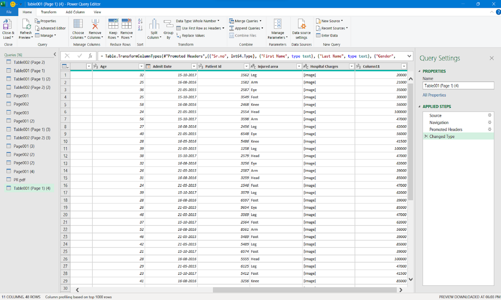
Leveraging additional tools Power Query and Power Pivot
- Power Query: It is a data transformation and cleansing tool in Excel, used for importing, cleaning, and transforming data from various sources. With Power Query, you can perform tasks like removing duplicates, splitting columns, and merging tables, among others.
- Power Pivot: This is a data modeling and analysis tool in Excel that allows you to create more complex data models than what is possible with standard Excel worksheets. With Power Pivot, you can create relationships between tables, aggregate data, and create calculated fields, among other tasks.
Putting it All Together:
Building reports and dashboards in Excel:
Building reports and dashboards in Excel involves creating visually appealing representations of data that others can easily understand. This involves selecting the right charts and graphs to display data, organizing data in a logical and meaningful way, and using formatting and design features to make the report or dashboard visually appealing and easy to navigate.
Storytelling with data: presenting your findings effectively:
Storytelling with data is the art of presenting data in a way that is engaging and easy to understand. This involves using data to tell a story, highlighting important insights, and using visuals and narratives to make the data more relatable and memorable.
Automating tasks with macros for efficiency:
Automating tasks with macros involves using Excel’s programming language. Visual Basic for Applications (VBA), creates automated processes that can save time and increase efficiency. This can include automating repetitive tasks, creating custom functions, and streamlining data analysis processes.
Sharing and collaborating on Excel data analysis projects:
Sharing and collaborating on Excel data analysis projects involves working with others to collect, analyze, and interpret data. This can include sharing data and spreadsheets, collaborating on data analysis projects, and using Excel’s collaboration features to work together in real-time. It also involves ensuring data security and privacy when sharing and collaborating on sensitive data.
Beyond the Basics:
Data validation:
Data validation refers to the process of ensuring that the data entered into a spreadsheet is accurate and consistent. This can involve setting up rules and restrictions on what type of data can be entered into specific cells, and checking for errors or inconsistencies in the data.

Here are the basic steps for performing data validation in a spreadsheet:
- Identify the cells or range of cells that require data validation.
- Choose the appropriate validation criteria based on the type of data you want to enter.
- Set up the validation rule for each cell or range of cells.
- Test the validation rule by entering different types of data into the cells.
- Fix any errors or inconsistencies detected by the validation rule.
By following these steps, you can ensure that your spreadsheet data is accurate, consistent, and free from errors or inconsistencies.
Regression analysis:
Regression analysis is a statistical technique used to explore the relationship between two or more variables. It involves identifying the strength and direction of the relationship between variables. And it helps to use historical data to make future predictions.
The basic steps of regression analysis are as follows:
- Collect the data: Obtain the data for the variables that you want to analyze. Surveys, experiments, and observations – these are just some of the methods you can use to achieve this.
- Choose the type of regression analysis: There are different types of regression analyses like linear regression, logistic regression, and multiple regression. Choose the appropriate type based on the nature of the variables and the research question.
- Check the assumptions: Don’t forget to check if your data meets the basic rules of regression analysis before starting. These include linearity, normality, homoscedasticity, and independence.
- Run the analysis: Use statistical software to run the regression analysis. The software will provide the coefficients, standard errors, t-values, and p-values for the variables in the model.
- Interpret the results: Interpret the results of the analysis in the context of the research question. Look at the coefficients, their significance, and the goodness-of-fit measures to understand the strength and direction of the relationship between the variables.
- Make predictions: Once the model is validated, it can be used to make predictions or forecasts based on historical data.
Excel is an incredibly powerful tool for data analysis. Its functions, formulas, and features make it an invaluable asset for anyone looking to analyze and interpret data. It’s useful for business owners, students, and anyone wanting to improve their data analysis skills. By using Excel, you can organize your data better, and understand it more easily.
Explore Excel’s full potential for data analysis and transform the way you approach it. Start unleashing your data analysis potential today!
Conclusion
Microsoft Excel is a widely used spreadsheet software program for data organization, analysis, and visualization. It offers features like formulas, charts, pivot tables, macros, and more. These features make it easy to perform complex calculations and data analysis tasks.
Additionally, it is available for Windows, Mac, and mobile devices. By mastering Excel, users can gain insights and make informed decisions based on their data.
CTA: Don’t wait, advance your career with Excel skills by joining our Advanced Excel Course.